
25 Finance Carousel Post Ideas For Instagram
Short carousels with clear U.S. numbers turn complex personal finance into save-worthy Instagram lessons.
Short carousels with clear U.S. numbers turn complex personal finance into save-worthy Instagram lessons.
4.98 /5 - from 58k reviews
Trusted by 50,000+ creators — get real engagement delivered to your profile in minutes, not days.
If you post finance content on Instagram, carousels are one of the best ways to teach more in less space. They work well for topics people want to save, like budgets, debt payoff, taxes, credit scores, and retirement basics.
In this guide, I break the ideas into five core money topics so you can pick posts that fit your audience and turn them into a repeatable series. The big themes are simple:
You’ll also see a clear pattern behind the ideas:
Here are the 25 post ideas covered in the article:
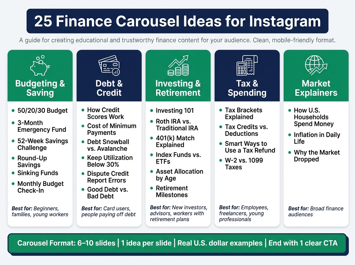
25 Finance Carousel Ideas for Instagram: 5 Topic Groups at a Glance
| Topic group | What it covers | Best fit |
|---|---|---|
| Budgeting & saving | Spending plans, cash buffers, savings systems | Beginners, families, young workers |
| Debt & credit | Credit score basics, payoff plans, report fixes | Card users, people paying off debt |
| Investing & retirement | IRAs, 401(k)s, funds, long-term planning | New investors, advisors, workers with retirement plans |
| Tax & spending | Refunds, brackets, deductions, contractor taxes | Employees, freelancers, young professionals |
| Market explainers | Inflation, downturns, big-picture market context | Broad finance audiences |
The main takeaway is simple: if you want finance posts people come back to, use short carousels with plain numbers, one lesson per slide, and topics tied to everyday U.S. money decisions.
Each idea below gives you three things: a concept, an angle, and the audience it fits best. Think of them as a starting point, not a script. The easiest way to make them work is to plug in numbers and examples your audience already knows, then build the post around that.
A simple format keeps the work light and the post clear. Use 6–10 slides:
That’s it. Clean, repeatable, and easy to use.
For each slide, anchor the point with one familiar U.S. example. Credit card APRs. Monthly subscription costs. A savings goal for an emergency fund. When people see numbers from daily life, the post clicks much faster.
You’ll also want to match the examples to the people you’re trying to reach. A post for creators should lean into save-worthy how-tos as part of their marketing on Instagram. A post for advisors should focus more on retirement and investing. Fintech brands tend to do well with simple before-and-after explainers that show a clear shift from one money habit or outcome to another.
When you build the carousel, keep it tight. Educational posts usually work best at 6–10 slides, with large headlines and one main idea per slide. Give the design room to breathe. Plenty of white space makes the post much easier to read on a phone screen.
With that format in place, the ideas below are much easier to turn into posts fast.
Start with the money topics people save and come back to most: budgeting and saving. These are everyday ideas, but they make strong carousel posts because they’re practical, easy to follow, and easy to act on.
1. The 50/20/30 Budget Breakdown
Split your income into three buckets: 50% for needs, 20% for savings and debt, and 30% for wants. Use a monthly take-home pay of $3,500 so people can see the math in plain English. This works well for beginners and young professionals who haven’t set up a formal budget yet. The CFPB’s "My spending rule to live by" uses this split.
2. Build a 3-Month Emergency Fund
This topic hits home because a lot of people are behind. Only 46% of Americans have enough saved to cover three months of expenses, and 24% have no emergency savings at all in 2026. A simple three-slide flow works well here: total up monthly expenses, set a weekly savings goal, then automate transfers. End with a CTA like save this for your next payday.
3. The 52-Week Savings Challenge
This one is simple on purpose. Save $1 in week one, $2 in week two, and keep going. By the end of the year, you’ve put away $1,378. It’s a good fit for creators and brands that want a low-lift savings post people can start right away.
4. How Round-Up Savings Actually Work
Round-up savings takes each debit card purchase, rounds it to the next dollar, and moves the spare change into savings on autopilot. It sounds small, but those tiny moves add up. Simmons Bank said its Round-Up program helped customers save nearly $5.5 million in the first 11 months of 2024. This is a strong topic for fintech brands that want to show automated saving in a way people can picture.
5. Sinking Funds: Save for What's Coming
A sinking fund means putting aside a set amount each month for a bill or purchase you already know is coming, like holiday gifts, school clothes, or a vacation. For example, saving $50/month starting in January gives you $600 by December for holiday spending. That makes this topic a natural fit for planners and families trying to avoid swiping a credit card for expected costs.
6. Track and Adjust: Your Monthly Budget Check-In
A budget on paper is one thing. A budget you check is what helps. Consumer.gov says that if your budget subtracts to less than zero, you’re spending more than you make and need to make changes. Build the carousel around a simple monthly routine: check, compare, adjust. This works well for advisors who want an educational post that builds trust without sounding salesy.
Debt and credit are top of mind right now. U.S. household debt hit $18.771 trillion in Q2 2026, and $1.263 trillion of that was credit card debt - up $54 billion from a year earlier. That’s why this category works so well for save-worthy posts. Keep it tight: one number, one payoff, and one action. In most cases, a simple carousel with one main takeaway per post does the job.
7. How Your Credit Score Is Actually Calculated
Walk through the five factors that shape a credit score: payment history, credit utilization, length of credit history, credit mix, and new credit applications. Also point out that unpaid debt and collections can affect it too. Then give people one small next step: log in to your credit account today and check your utilization rate and any late payments from the last 12 months. This topic lands well with broad audiences, especially first-time credit card users.
8. The Real Cost of Minimum Payments
Show what happens to a $1,000 balance at 20% APR when someone pays only the $25 minimum. Then compare it with paying $75 per month instead. The timeline gets much shorter, and that contrast is the whole point. A before-and-after slide makes the math easy to grasp. This is a strong format for creators who want to make the point without sounding like they’re lecturing anyone.
9. Debt Snowball vs. Debt Avalanche
Lay out each debt by balance and APR. With the snowball method, you knock out the smallest balance first for quick wins. With the avalanche method, you go after the highest APR first to cut interest costs. A side-by-side slide works well because people can see both paths at once. End with this CTA: "Are you Team Snowball or Team Avalanche? Drop it in the comments."
10. How to Keep Reported Utilization Below 30%
This one is simple but useful: paying down your balance before your statement date, not only before the due date, can lower your reported utilization fast. That single detail is easy to miss, and it makes a great carousel hook. Fintech brands can connect this topic to a payoff calculator or another product-led savings angle.
11. How to Dispute a Credit Report Error
If your credit report shows wrong information, your score can take a hit. The CFPB says to dispute inaccurate information with both the bureau and the furnisher, in writing, and include supporting documents. A step-by-step carousel is a strong fit here because people want plain directions, not vague advice. This kind of post works especially well for advisors and education-first brands.
12. Good Debt vs. Bad Debt
Not all debt works the same way. A student loan is not the same as a high-interest store card used for day-to-day spending. A simple two-column slide can show the gap between lower-cost borrowing and high-cost revolving debt. This topic fits financial coaches and advisors that want to shift how people think about borrowing.
Once debt and credit feel less messy, the next set of carousels can move into investing and retirement.
Once debt feels more manageable, people usually start asking the next big question: How do I make my money grow? That’s why investing and retirement content hits home. By the end of 2025, U.S. retirement assets reached $49.1 trillion. Employer-sponsored defined contribution plans and IRAs made up 68% of all retirement market assets. That’s not some far-off finance stat. It shows just how many people are dealing with these choices right now.
These six carousel ideas line up with the stuff people already want help with.
13. Investing 101 for First-Time Investors
Start with the basics and keep it simple. Explain what a stock is, what a bond is, what a brokerage account does, and how compounding works. One idea per slide works well here, so people don’t feel lost halfway through. This topic fits creators speaking to young professionals who know they should invest, but still feel a little nervous about getting started. Using an Instagram growth service can help these creators reach the right audience more effectively.
14. Roth IRA vs. Traditional IRA
This one comes down to when taxes show up. A Roth IRA uses after-tax dollars, so withdrawals in retirement are tax-free. A Traditional IRA puts taxes off until you withdraw. One slide can cover tax treatment, and another can explain withdrawal rules. It’s a good post for beginners trying to choose their first retirement account.
15. 401(k) Match Explained
A lot of employees miss out on employer match dollars because they contribute less than they need to. And yes, that’s basically leaving money behind. A simple slide showing how much match someone gives up can make the point hit harder. This idea works well for fintech brands and advisors speaking to people with workplace plans.
16. Index Funds vs. ETFs
A side-by-side comparison is the cleanest way to handle this topic. Keep the focus on structure, how each option works, and where the differences matter. Then end with a simple CTA asking which one they use. This is a strong fit for self-directed investors who know the basics but want a clearer view.
17. Asset Allocation and Why It Changes Over Time
Asset allocation means how a portfolio is divided among stocks, bonds, and cash. This gets a lot easier to understand when people can see it. For example, you can show a portfolio with more stocks in someone’s 20s, then a mix with more bonds as retirement gets closer. Add a slide on rebalancing, and the post becomes much more useful.
18. Retirement Milestones by Age
Fidelity reported an average 401(k) balance of $155,800 in Q2 2026, along with a total savings rate of 14.4%. That gives you a strong opening stat. From there, use simple benchmark ranges by decade, like your 30s, 40s, and 50s, so people have something concrete to compare against. This format works well for advisors who want to start a conversation without sounding pushy.
Next, shift to taxes, spending, and market basics.
Taxes, spending, and market explainers are great for turning messy money topics into carousels people save and share. The best place to start is with the tax topics that make people uneasy, then move into spending habits and market swings they deal with all the time.
19. Tax Brackets Explained
The U.S. uses marginal tax brackets. That means only the income that falls inside each bracket gets taxed at that bracket's rate. For individuals, the federal system has seven rates: 10%, 12%, 22%, 24%, 32%, 35%, and 37%.
Here’s the part many people miss: if a single filer earns $60,000 in 2024, they do not pay 22% on the full $60,000. They pay 22% only on the portion above $47,150.
For a carousel, keep it simple. Use one slide per bracket and show an income ladder so people can see how the rates stack up. This tends to land well with young professionals, especially after a raise, when the first thought is often, "Did I just get pushed into a tax mess?"
20. Tax Credits vs. Tax Deductions
This one works because the difference is simple once you see it.
A deduction lowers your taxable income. A credit lowers your tax bill dollar for dollar.
The fastest way to make that stick is with a plain example: a $1,000 deduction saves someone in the 22% bracket about $220, while a $1,000 credit saves them the full $1,000.
A clean format would be:
People often mix these up, so this kind of post tends to get saves fast.
21. Smart Ways To Use Your Tax Refund
A big refund can feel like free money, but it often means you gave the IRS an interest-free loan during the year.
That opening alone can stop the scroll.
From there, you can walk through five smart ways to use a $1,200 refund:
This topic also invites easy engagement. A simple prompt like comment what you did with last year's refund can get people talking without much friction. If you're stuck on wording, ChatGPT for Instagram can help draft engaging captions and prompts.
22. W-2 vs. 1099: How Your Taxes Change
This is one of those topics that feels dry until someone gets hit with a tax bill they didn't see coming.
A W-2 employee has taxes withheld automatically. A 1099 contractor has to handle taxes on their own. A useful rule of thumb is to set aside around 25–30% of 1099 income for federal and state taxes, so there's less chance of getting surprised later.
A simple carousel flow works well here:
That gives people something direct they can use right away.
23. How U.S. Households Spend Their Money
This topic works well because people always want to know, "Am I spending way more than everyone else?"
In 2024, U.S. households spent an average of $78,535, or about $6,545 per month. Housing made up 33.4% of that total ($26,266), followed by transportation at 17.0% ($13,318) and food at 12.9% ($10,169).
A pie chart is the obvious move here. You can use free AI-powered Instagram tools to generate these visuals quickly. People can glance at it and get the picture in seconds. Then you can add a slide that invites them to screenshot it and plug in their own numbers.
It also helps to add a slide with common planning targets, such as housing below 30% of gross income and total debt payments below 36%. That turns the post from "interesting stat" into something people can use.
24. Inflation Explained for Everyday Life
Inflation feels abstract until grocery prices, rent, and insurance premiums start creeping up.
U.S. CPI inflation has been running around 3.4% year-over-year in mid-2026, with shelter costs making up a big part of that increase.
You don't need to drag people through economic theory here. A better approach is to show inflation through everyday life:
the same basket of goods costs more than it did a year ago
Then explain how inflation is measured, what the Federal Reserve tries to do about it, and how cash in a low-yield account slowly loses buying power. A strong closing slide can give one or two next steps, like checking whether a savings rate has kept up with recent rate increases.
25. Why the Market Dropped, Explained Simply
When headlines get noisy, this is the post people send to friends and family.
Use a simple 10- to 20-year S&P 500 line chart to show that short-term drops often look much smaller when you zoom out. Then add a slide that explains the difference between a correction, a bear market, and a crash.
The tone matters here. Keep it calm and grounded in data. The core message is straightforward: time in the market has historically mattered more than timing the market.
Once you have the topic, slide 1 does the heavy lifting. It decides whether people swipe or keep scrolling. For U.S. finance audiences, the best hooks are specific, tied to a pain point, and grounded in actual dollar amounts. Lines like 5 money mistakes quietly costing Americans $300/month or If you make between $50,000–$85,000/year, here's how to use your money smarter tend to work well because they spark curiosity and point to a clear result. A smart move here is to write the hook last, after the rest of the carousel is done, so you know exactly what slide 1 is promising.
Keep it to one idea per slide. That could be a problem, a concept, an example, an action step, or a CTA. On a phone screen, each slide should land its point in under three seconds. If you cram in two or three ideas, people drop off fast.
For compliance-sensitive topics like investing, retirement, or taxes, stick with plain language and an education-first frame. Use simple wording, ranges, and avoid performance promises. A myth-vs-fact format works well because it clears up common mix-ups - like the belief that carrying a credit card balance helps your score - without sounding like personal advice. Add a short educational disclaimer on the final slide and use proven Instagram caption ideas to drive engagement. Then make the CTA direct, so readers know what to do next.
A few CTA types tend to work best:
You can back up the CTA in the caption with U.S. time cues like this weekend or before the end of the year. That gives the action a deadline and makes it feel more immediate.
Track saves, shares, and swipe-through rates over 30–60 days to see which finance angles get the best response. UpGrow's real-time analytics and audience filters help identify which finance topics earn the most saves and shares.
These 25 ideas work for a simple reason: they deal with common U.S. money issues people face every day - paychecks, debt, 401(k) matches, and tax notices. That kind of specificity is why finance carousels feel useful, practical, and worth saving.
A smart way to run with this is to choose 2–3 repeatable formats and post them on a weekly or monthly schedule. Keep the slide layout the same each time, then swap in new U.S.-based numbers and examples. That kind of consistency helps people know what to expect, and it also makes it easier to track what clicks.
Your content mix should cover the main parts of personal finance, including:
Once you have that mix in place, watch which topics drive the most saves and follows. Use UpGrow's analytics to see which series brings in the most saves and account growth.
Start simple, stay specific, and use U.S. numbers. That keeps the series focused and worth saving.
Educational finance carousels tend to earn the most saves. Why? They give people clear, practical help they can use later, which also helps build trust over time.
Evergreen topics usually do best here. If a post stays useful for months, people are far more likely to save it and come back when they need it.
In 2026, Instagram’s algorithm puts more weight on saves. That means high-value finance content can get more reach when people bookmark it for later.
For finance creators, a save-to-reach ratio of 6% or more is a strong target.
Start with UpGrow’s Viral Content Library to find niche-specific post ideas that are already trending. Then check its real-time analytics dashboard to see which posts earn the most likes, shares, and saves.
You can also use UpGrow’s Smart AI-Targeting to review audience details like age, gender, and location. That way, your topics line up more closely with what your followers care about.
Put clarity first.
Keep lines short, direct, and easy to scan so viewers can grasp complex financial ideas fast.
Change the visuals every 3 to 5 seconds. Use B-roll cuts, zooms, or text overlays.
A hybrid format can work well too: mix static photos with short 3 to 5-second video clips to hold attention.


