AI Fashion Photography for Instagram: Trend Guide
Practical workflow to produce accurate, on‑brand AI fashion images for Instagram: briefs, prompts, formats, editing, and analytics.
Practical workflow to produce accurate, on‑brand AI fashion images for Instagram: briefs, prompts, formats, editing, and analytics.
4.98 /5 - from 58k reviews
Trusted by 50,000+ creators — get real engagement delivered to your profile in minutes, not days.
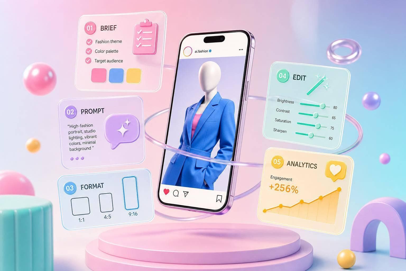
AI fashion images can cut a $2,000–$10,000+ daily shoot cost down to a $20–$20–$100 monthly tool stack.00 monthly tool stack. If I want Instagram content that looks polished and ships fast, the play is simple: set a clear visual plan, build prompts that lock in garment details, make images for the right post type, fix errors before export, and track what gets clicks, saves, shares, and reach.
Here’s the article in plain English:
One stat stands out: 71% of shoppers couldn’t tell high-end AI fashion images from real photos, but trust drops when seams, buttons, or fabric texture look off. So the job is not just making images fast. It’s making them look right, fit the brand, and match the post goal.
If I had to boil the whole article down to one line, it would be this: use AI to make more Instagram fashion content, but keep the process tight so the clothes still look correct and the posts still perform.
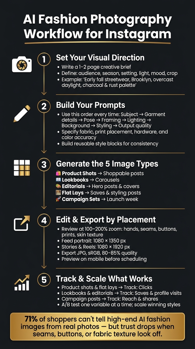
AI Fashion Photography Workflow for Instagram: 5-Step Process
Consistent AI fashion images start with a clear visual direction. Put together a short visual brief that spells out the brand style, audience, theme, palette, and mood. Once that direction is set, that brief becomes the starting point for every prompt.
Keep the brief to 1–2 pages, but make each detail specific. Swap vague direction like "fall vibes" for something concrete like "early fall streetwear in Brooklyn, soft overcast daylight, brick buildings, charcoal and rust palette."
Fill in these fields before you generate a single image:
| Field | What to include | Example |
|---|---|---|
| Product category | The specific item(s) being featured | Women's oversized denim jacket |
| Target customer | Age, location, lifestyle, income range | Women 24–32, NYC, creative fields, $70K+ income |
| Season and timing | U.S. launch window | Fall streetwear for September–November |
| Setting | Where the scene should feel like it's happening | SoHo street corner in New York, Miami beachfront hotel pool, cozy living room with holiday décor in Chicago |
| Lighting style | Mood and light source | Soft overcast daylight, warm golden hour, indoor tungsten glow |
| Framing | How much of the garment and scene is visible | Full-body street-style, 3/4 poolside, flat lay top-down |
| Mood words | 3–6 adjectives | Effortless, urban, candid / Sun-drenched, aspirational, relaxed |
| Output format | social media image sizes like 4:5 feed, 9:16 Reels, or Story backgrounds | 4:5 feed posts, 9:16 Reels covers |
This brief acts like a filter for every product shot, lookbook frame, editorial image, flat lay, and campaign set. After that, turn the brief into prompts that lock down garment details and scene styling.
Use the same structure every time: subject → garment features → pose and body language → framing → lighting style → background and setting → scene styling details → output quality. Keeping that order steady helps your results stay aligned. Even if the location changes, the images still follow the same visual logic.
For garment details, get specific about the parts people notice right away when they look off. Name the fabric, like soft brushed cotton fleece or medium-weight raw denim with visible grain. Describe print placement, such as small graphic logo centered on chest or all-over floral print evenly distributed. Call out hardware, like a silver metal zipper with chunky teeth or matte black snap buttons. And when color matching matters, always mention accurate color reproduction.
Do the same for footwear and accessories. Include the silhouette, material, and practical details like a top zipper closure or adjustable strap with metal buckle. Those small calls make a big difference and help the output stay close to the product.
A full prompt for a fall hoodie post might read: Full-body portrait of a young adult walking across a New York City crosswalk, wearing an oversized charcoal-gray hoodie with front pocket and subtle embroidered logo, paired with black cargo pants and chunky white sneakers, relaxed confident stride, shot at street level with slight upward angle, soft overcast daylight, city street background with brick buildings in soft focus, realistic fashion photography. That amount of detail helps keep the image product-accurate.
It also helps to build a reusable style block for lighting, background, and output style so the campaign keeps the same look from post to post. With the direction and prompts locked in, the next step is generating each fashion format using the same visual rules.
With your creative brief and prompt structure set, pick each image format based on the job it needs to do: sell, explain, set the mood, or back up a launch. Start with the format that fits the post goal.
Product shots are often the strongest sales asset in the mix. They work well for launch posts and restocks, and they keep pulling their weight later as evergreen posts for any shoppable item.
You’ll usually work with two main styles. Studio-style AI product shots use neutral backgrounds like white, light gray, or a soft gradient, with the item centered in a 4:5 crop. They’re fast to batch-generate and simple to standardize across a full collection. Lifestyle AI product shots place the product in a setting like an urban street, a minimalist apartment, a vanity, or another outdoor scene. These take more prompt testing, but they do more of the storytelling and can help drive engagement and saves.
Keep shadows subtle and clean. They add depth, but they shouldn’t pull attention away from the product.
| Style | Realism | Speed | Brand storytelling | Conversion use |
|---|---|---|---|---|
| Studio-style AI product | High garment accuracy, simple lighting | Fast to batch and standardize | Low–medium, very functional | Strong for shoppable posts and tags |
| Lifestyle AI product | Medium–high, more complex scenes | Moderate, more prompt testing | High, shows lifestyle and context | Strong for engaged followers ready to buy |
A simple way to use both: cover every SKU in the collection with studio shots, then add lifestyle shots for top sellers or hero products when you want more desire around the product tag.
Once the product is clear, the next step is the lookbook - where the outfit starts to make more sense in context.
Lookbooks and editorials help turn one collection into a swipeable story. A well-planned carousel can carry that story across up to 10 slides, and Instagram allows up to 10 images or videos per carousel.
Catalog lookbooks stay close to actual inventory. Each slide should show a clear front or 3/4 view of a full outfit, and the images need to match real colorways and silhouettes exactly. Editorial lookbooks give you more room to play with lighting, location, and poses. These work best as grid covers, Reels thumbnails, and hero carousels during big storytelling moments like back-to-school, Black Friday, or the holiday season. Catalog looks are for clarity. Editorial looks are for attention.
| Type | Purpose | Styling freedom | Product accuracy | Best Instagram placement |
|---|---|---|---|---|
| Catalog lookbooks | Show full outfits and collection range clearly | Moderate, aligned to real inventory | Very high; must match real product | Carousels, Shop integration, link-in-bio traffic |
| Editorial lookbooks | Build mood, narrative, and brand image | High; experimental scenes and poses | Medium; more stylized interpretations | Grid covers, Reels thumbnails, hero carousels |
For carousel sequencing, lead with a strong hero shot on slide 1. Then move into 2–4 full catalog looks. After that, shift to detail frames like close-ups of fabric, stitching, or hardware. Close with a context slide or a clean CTA frame. That flow gives people a reason to keep swiping while keeping the product front and center.
When one image needs to sum up details, accessories, or a full set at a glance, flat lays do that job well.
Flat lays tend to get saved. People use them as styling references, which makes them useful for algorithm signals and long-tail engagement. They’re especially strong for accessories, beauty sets, and capsule outfit bundles, where an overhead view can show the full picture better than most other angles.
Use flat lays as support posts that break up hero images and pull attention to details. In campaign series, they help keep the collection visible between hero posts. A common rhythm is teaser, launch, detail, and reminder posts spread across a 7–14 day window.
| Flat lay type | Setup complexity | Visual control | Post objective |
|---|---|---|---|
| Single-product flat lay | Low; one main item, simple props | Very high; focus on one subject | Highlight one hero piece, clarify details |
| Multi-product flat lay | Medium–high; several items arranged | Medium; more elements to manage | Show full sets, bundles, or capsule collections |
| Styled flat lay with props | Medium; product plus lifestyle props | Medium–high; narrative but controlled | Build mood, tell a lifestyle story, brand positioning |
Pick the flat lay type based on what the post needs to do. If the goal is product clarity, go with a single-product flat lay. If you’re showing a “weekend essentials” bundle or a capsule wardrobe for the fall transition, use a multi-product layout. If the post is more about brand feel than direct sales, a styled flat lay with a few lifestyle objects - like a coffee cup, a book, or sunglasses - adds context without making the frame feel crowded.
The edit pass is where quality control happens. This is the point where you catch the stuff that makes an image feel polished - or instantly fake. After generation, run every image through a quick cleanup pass before posting. And each edit should match where the image will live: feed, carousel, Story, or Reels cover.
Start by generating a few versions for each concept. Then pick the strongest 1–2 based on pose, garment visibility, and overall clarity. A strong first pick saves a lot of cleanup time later.
After that, zoom in to 100–200% and look for obvious glitches before you spend time fixing smaller details. Check anatomy first, then garment construction, then background cleanup, and finally color consistency. If the clothing has construction errors, use targeted inpainting to fix things like misaligned seams or floating buttons. Once the image is clean, apply one consistent color grade across the full series so the set feels visually aligned.
Next, format each image for its exact Instagram placement. Export one file per placement. Don’t depend on one master crop and hope it works everywhere. Common Instagram sizes are 1080 × 1080 px or 1080 × 1350 px for feed, and 1080 × 1920 px for Stories and Reels.
| Placement | Recommended size | Notes |
|---|---|---|
| Feed portrait | 1080 × 1350 px | Best for fashion; maximizes mobile screen space |
| Feed square | 1080 × 1080 px | Works for grid consistency and product-focused posts |
| Stories | 1080 × 1920 px | Full-screen vertical; images display for 5 seconds by default |
| Reels / Reels cover | 1080 × 1920 px | Center the key subject in a 4:5 safe zone for a clean grid preview |
When you export, use JPG in sRGB at 80–85% quality. Before scheduling anything to boost your Instagram presence, preview every file on a phone in Instagram. Make sure faces, garments, and any text overlays sit inside the visible crop area and aren’t covered by UI elements.
The biggest problems are usually the easiest to spot. These are the AI tells that often slip past the first edit, so it helps to check for them on purpose.
| Common AI error | Correction method |
|---|---|
| Warped hands or anatomy | Manual retouching tools; regenerate if structurally broken |
| Inaccurate seams or garment construction | Tighter prompts and targeted inpainting |
| Damaged jewelry or accessories | Manually rebuild or re-generate the isolated element |
| Unreadable prints or logos | Re-render at higher detail; simplify the composition |
| Mismatched lighting or skin tones | Overall color correction across the series |
| Over-smoothed skin texture | Reduce retouching intensity; avoid a plastic look |
| Cluttered flat lays | Remove extra objects; increase negative space around key items |
| Subject cropped in Stories or Reels | Re-export in 9:16 and verify mobile safe zones before posting |
If a garment’s construction is structurally wrong - like misaligned shoulders or a floating waistband - it’s often faster to regenerate with tighter posing prompts. Then blend the better output into the chosen image with layer masks, instead of trying to rebuild the whole area by hand.
Once posts are live, track performance and let the numbers shape the next batch.
Tie each format to one main metric. That keeps your review process simple and helps you spot what’s working fast.
Log every post in a simple spreadsheet. Tag each one by format type, visual style, and key prompt details like lighting setup, background, and garment category.
Here’s why that matters: patterns start to show up fast. If posts tagged with soft window light and a neutral studio backdrop keep earning more saves than posts tagged with bold flash and an urban street setting, that’s a strong sign. Your prompt library should lean more toward the first style.
Use age, gender, and city data to see which formats each group responds to most. Track carousels separately from single-image posts. Then run that same breakdown by season and retail period so you can catch patterns tied to launch windows.
For A/B tests, change one variable at a time. That could be background style, lighting, or prompt emphasis. Keep captions and posting time the same. Pick a winner only when one version beats the control across enough impressions to feel reliable. After that, make the winning direction your default for most posts, and use the remaining slots to test new versions.
Use those performance signals to reach the people most likely to respond. Strong visuals help, but they still need the right audience. UpGrow connects your content to real, targeted audiences using patented AI technology and human Instagram experts - no bots, no fake followers. The targeting filters let you segment by location, age, gender, and language, so you can match different visual directions to specific audience groups. The live analytics dashboard tracks reach, engagement, and follower growth in real time, and the Boost™ tool amplifies posts that are already gaining traction organically.
The workflow that tends to hold up is simple: start with a clear one-page creative brief, build reusable prompt templates around garment accuracy and lighting, plan a content mix across product shots, lookbooks, editorials, and flat lays, and edit carefully before every post.
Put another way: begin with a brief creative brief, reusable prompts, careful editing, and weekly performance checks. Then scale the styles that win.
Build a signature prompt template that includes your brand’s core elements, such as your color palette, lighting, and mood. That gives you a solid starting point every time, so your content doesn’t drift from one post to the next.
When you edit, use style templates to keep fonts, logos, and color grading consistent across posts. Think of it like setting the stage before the performance starts. The details may seem small, but they help people recognize your brand at a glance.
Stick to an 80/20 balance: keep most of your content inside brand guidelines, and leave a little room to test new ideas. That way, your feed stays familiar without feeling stale.
And one more thing: always review AI outputs by hand. Fix errors, clean up odd choices, and add your own touch so the final result feels like you, not just a machine draft.
Start with carousels and Reels. Right now, they tend to beat single-image posts when it comes to visibility and engagement.
For static posts, use vertical images so your content takes up more screen space.
Before you publish, run your visuals and captions through an AI tool with pre-publish scoring. It’s a simple way to catch weak spots before the post goes live.
If you’re not sure where to begin, UpGrow’s Viral Content Library can give you a solid starting point with curated templates and trend-based ideas.
Regenerate the image by tightening the prompt when the overall look is off. If the concept, style, lighting, or mood doesn’t match what you want, that’s usually faster than trying to patch it by hand.
Use editing tools like a magic brush or erase/restore when the issue is small and isolated. That works well for blurry edges, halos, or tiny pixel-level mistakes.