
How to Match Highlight Covers to Your Brand Aesthetic
Custom Instagram Highlight covers using brand colors, simple icons, and readable typography instantly sharpen your profile and boost engagement.
Custom Instagram Highlight covers using brand colors, simple icons, and readable typography instantly sharpen your profile and boost engagement.
4.98 /5 - from 58k reviews
Trusted by 50,000+ creators — get real engagement delivered to your profile in minutes, not days.

Your Instagram profile has seconds to make an impression. Highlight covers, sitting right below your bio, are one of the first things visitors notice. Well-designed covers not only enhance your profile's visual appeal but also act as a navigation tool, organizing content into categories like Products, Reviews, or FAQs. Profiles with custom covers see up to 30% more interactions compared to those using default thumbnails.
To create effective Highlight covers:
Use tools like Canva or PicMonkey to create covers, ensuring designs fit Instagram's circular crop. Once ready, upload directly via Instagram’s “Edit Highlight” feature. A polished set of Highlight covers can make your profile look professional, organized, and worth following.
Before you dive into designing, it's essential to establish your brand's visual identity. Without a clear foundation, your Highlight covers can end up feeling disjointed and unprofessional.
Your brand's visual identity boils down to four main elements: color palette, typography, imagery style, and iconography. These elements work together to create a cohesive look and feel, shaping how visitors perceive your brand - often before they even read a word. For Instagram Highlights, these elements are critical because they tie directly into your overall aesthetic.
Color is a powerful tool for setting the tone. It triggers immediate emotional responses - blue suggests trust and dependability, black conveys a sense of luxury, and bold reds exude energy and urgency. For Highlight covers, stick to 2–3 core brand colors and use them consistently across all covers. Repetition builds familiarity and recognition over time.
Typography is another detail that can’t be overlooked. Instagram’s small display size (around 86×86 pixels on a profile) makes thin or overly decorative fonts hard to read. Instead, stick to bold, sans-serif fonts and limit text to 1–3 words. Your font should also align with your brand’s personality - a clean, geometric sans-serif feels sleek and modern, while a heavier slab serif projects confidence and strength.
Iconography brings everything together. Consistency is key - make sure your icons share the same line weight and style. Avoid mixing thick, filled icons with thin, outlined ones. As ContentCreators.com wisely notes:
"Recognizability beats perfection every time."
A consistent set of icons that matches your brand’s tone will always resonate more than a mismatched collection.
Before creating new Highlight covers, take a step back and review your current Instagram profile. Look for recurring themes: What colors dominate your posts? Which fonts or photography styles appear most often? These patterns will guide your design choices.
One helpful method is the "deviation test": crop your profile picture out of your last nine posts and see if a stranger could still recognize your brand just from the visuals. If the answer is no, your visual identity might need some fine-tuning before you start working on Highlight covers.
Also, ensure your Highlight row reflects the promise in your bio. For example, if your bio says you help small businesses grow, but your Highlights feature unrelated content, it creates confusion for new visitors. A consistent profile builds trust and reinforces the credibility that custom Highlight covers are meant to enhance. By auditing your profile first, you’ll ensure your new covers align with your established brand identity.
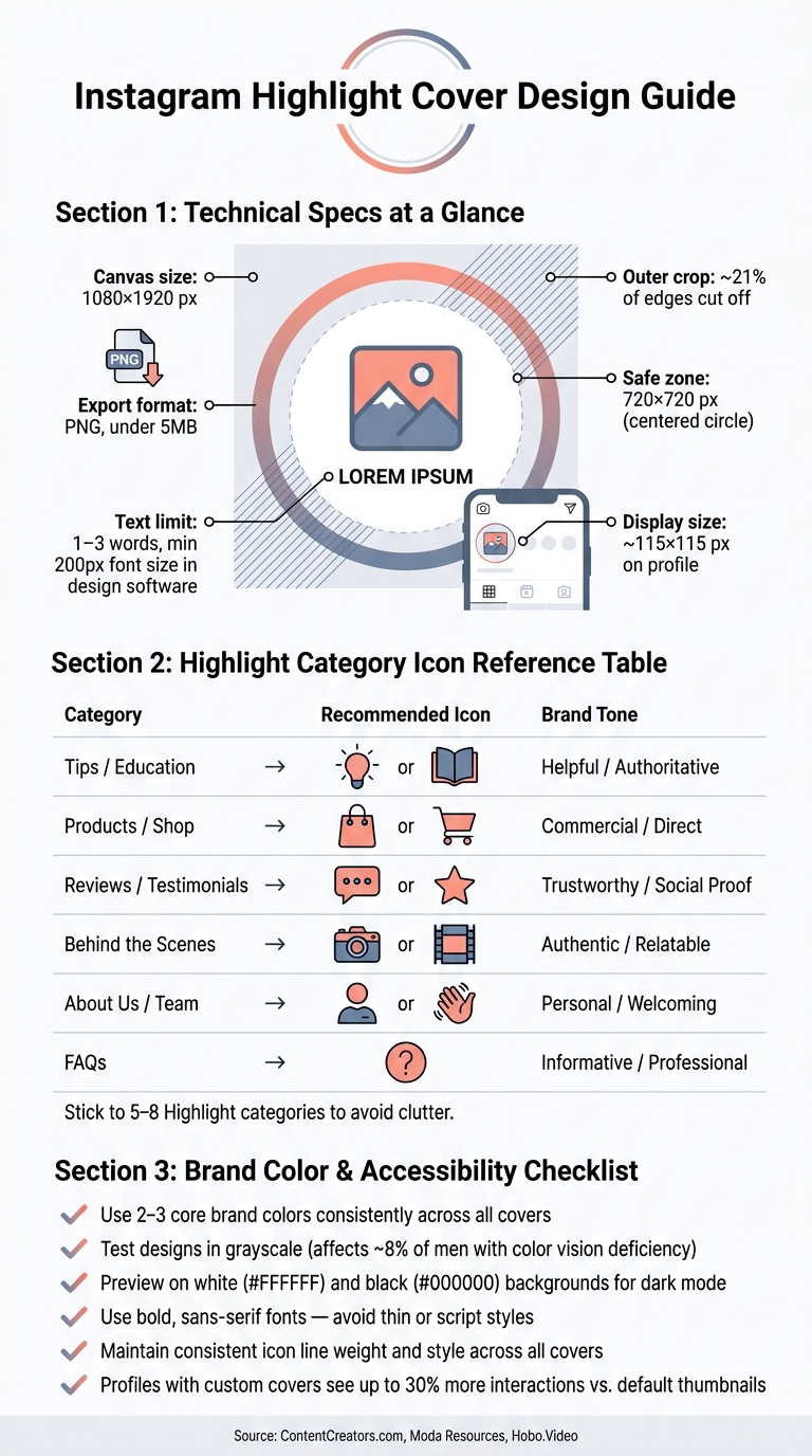
Instagram Highlight Cover Design: Icon & Category Guide
Creating Highlight covers that align with your brand isn't just about aesthetics - it's about making them unmistakably yours. These design strategies help you transform your visual identity into cohesive, recognizable Highlight covers.
Start by locking in your exact brand colors. Use tools like Coolors or Adobe Color to extract the precise hex codes from your logo or profile picture. This ensures your Highlight covers feel like a natural extension of your Instagram profile, not an afterthought.
Once you have your palette, choose one dominant brand color for the background of all covers. Pair it with a high-contrast neutral for the icons. Since Highlight covers display at about 115×115 pixels, fine details and low-contrast designs can become hard to distinguish. To ensure accessibility, test your design in grayscale to confirm the icons remain clear for users with color vision deficiencies, which affect about 8% of men.
Additionally, preview your covers on both pure white (#FFFFFF) and pure black (#000000) backgrounds to ensure they look good in Instagram's dark mode.
At small sizes, simplicity is key. Detailed illustrations may look great at full scale but can become unrecognizable when shrunk down. Stick to clean, minimal symbols that communicate their meaning instantly.
Select icons that align with your brand identity and are easy for first-time visitors to recognize. For example, a shopping bag works well for a shop, a chat bubble for reviews, or a camera for behind-the-scenes content. The table below offers suggestions for common Highlight categories:
| Highlight Category | Recommended Icon | Brand Tone |
|---|---|---|
| Tips / Education | Light bulb or Book | Helpful / Authoritative |
| Products / Shop | Shopping bag or Cart | Commercial / Direct |
| Reviews / Testimonials | Chat bubble or Star | Trustworthy / Social Proof |
| Behind the Scenes | Camera or Film frame | Authentic / Relatable |
| About Us / Team | Person icon or Wave | Personal / Welcoming |
| FAQs | Question mark | Informative / Professional |
Stick to 5–8 Highlight categories to avoid cluttering your profile. Too many categories can dilute the impact of each cover.
Typography plays a big role in reinforcing your brand voice. When done right, it strengthens your visual message; when done poorly, it can confuse or distract.
Limit your text to 1–3 words per cover. Use medium or bold font weights, with a minimum of 200px in your design software. Thin or script fonts tend to blur or become unreadable at small sizes. Always zoom out to the 115×115 pixel size to confirm readability.
Keep your text within the centered safe zone of about 880 pixels in diameter on a 1080×1920px canvas. This ensures nothing important gets clipped by Instagram's circular crop. Save your designs as PNG files to maintain crisp edges on text and icons.
"When your visuals look outdated or inconsistent, people notice, even if they don't say it. They lose trust quietly." - Hobo.Video
Canva is a popular choice for designing Instagram Highlight Covers. Simply search for "Instagram Highlight Cover" in Canva's template library to find pre-sized, customizable designs. Once you pick a template, you can tweak it to fit your brand by adding your colors, centering your icon, and duplicating the design to create a consistent set of covers. While Canva's free version offers plenty of tools for beginners, upgrading to Canva Pro unlocks brand kits and premium design elements for more customization options.
PicMonkey is another straightforward tool for this task. Begin with a blank "Instagram Story Highlight Cover" template, use the color dropper to input your specific hex codes, and make sure your icon is centered before exporting your design.
For both tools, set the canvas dimensions to 1080×1920 pixels, center your icons or text, and export the file as a PNG. Keep the file size under 5MB to ensure smooth uploads. Once your design is ready, confirm that it displays well on Instagram by exploring creative Highlight ideas for your brand.
Instagram crops Highlight covers into circles, which means about 21% of the image's outer edges will be cut off. To avoid losing important details, make sure all critical design elements - like icons, text, or logos - are positioned within a centered 720×720 pixel safe zone on the 1080×1920 canvas.
"Design your icon or graphic within the center ~720×720px area to ensure it displays correctly in the circular crop." - Moda Resources
Before uploading, test your designs against both a white background (#FFFFFF) and a black background (#000000) to ensure they look great in both light and dark modes. To upload your covers without posting them to Stories, use Instagram’s Edit Highlight > Edit Cover feature.
Once you’ve created covers that align with your brand, applying them to your Instagram Highlights is quick and easy. For an existing Highlight, press and hold its circle, then tap Edit Highlight > Edit Cover. From there, select your custom design from your camera roll, adjust it using pinch-to-zoom, and tap Done. For a new Highlight, tap the "+" icon on your profile, choose archived Stories, tap Next, then select Edit Cover before saving. The best part? You don’t need to post the cover image as a Story first - it uploads directly from your gallery.
A couple of things to keep in mind: Editing a Highlight will move it to the first position, so plan your updates if you care about the order. Also, keep Highlight titles under 10 characters to avoid awkward truncation on your profile. After uploading, take a moment to check your profile layout to ensure everything looks cohesive.
Once your covers are in place, step back and evaluate how they fit into your profile’s overall design. Look at the first 5–7 Highlights as a group, considering how the colors, icons, and style work together. Your covers should enhance your bio, profile photo, and top grid posts rather than clash with them.
"A mismatched set of covers looks unprofessional and confuses visitors. Consistency builds trust and makes your profile look intentional." - InfluenceFlow
Here’s a quick tip: Hold your phone at arm's length to see if the designs blur or lose clarity. If they do, simplify them for better readability. Don’t forget to check how your covers appear in Instagram’s dark mode to ensure they still look polished. Taking these extra steps can make all the difference in leaving a strong impression.
By refining your design process - from defining your brand's visual identity to creating custom Highlight covers - you’re setting the stage for a more impactful Instagram profile by exploring hidden Instagram features. Small touches like consistent, tailored Highlight covers can make a big difference. They give your profile a polished, professional look and show visitors that your brand is well-organized and worth their attention.
Stick to a cohesive color palette, maintain a unified icon style, and refresh your covers regularly - whether quarterly or with each new campaign - to keep things visually engaging.
For an added boost, consider leveraging UpGrow's AI-powered Instagram growth service. This platform blends advanced AI with real human expertise to attract authentic followers using smart targeting filters like location, age, language, and interests. Beta users of its Boost™ feature saw a 275% increase in monthly followers, and the service boasts a 4.98/5 rating from over 58,980 users.
Start applying these design updates today. Your enhanced Instagram presence begins with the next cover you create.
The ideal size for Instagram Highlight covers is 1080 x 1080 pixels, maintaining a 1:1 aspect ratio for a clean, precise look on your profile. For those who want extra resolution and versatility, some designers recommend going with 2000 x 2000 pixels. Keep in mind that the displayed icons are only 110 x 110 pixels, so it's best to stick with simple, high-quality designs to ensure they look sharp.
To keep your Highlight covers looking great within the circular crop, make sure to center important elements like icons or text on your 1080x1920 pixel canvas. Place key graphics within an 880-pixel diameter "safe zone" to prevent them from being cut off. Stick to clean, high-contrast designs with minimal text, avoiding thin fonts and cluttered backgrounds. Before uploading, scale your design down to 115x115 pixels to ensure everything remains clear and readable.
For a polished and approachable profile, stick to 5–10 Highlight categories. This balance ensures your profile stays neat and simple to browse while showcasing essential themes like testimonials, products, or behind-the-scenes moments. Thoughtful organization allows visitors to grasp your brand's message quickly, encouraging them to explore more. Tools like UpGrow can assist in expanding your audience by connecting you with genuine followers who actively engage with your curated content.


