Ultimate Guide to Instagram Profile Aesthetics
Create a cohesive Instagram profile with a clear profile photo, 3–5 color palette, consistent editing, planned grid layouts, Highlights, and growth tools.
Create a cohesive Instagram profile with a clear profile photo, 3–5 color palette, consistent editing, planned grid layouts, Highlights, and growth tools.
4.98 /5 - from 58k reviews
Trusted by 50,000+ creators — get real engagement delivered to your profile in minutes, not days.

Your Instagram profile is your visual resume. It’s often the first impression people have of you or your brand. A well-thought-out aesthetic can boost followers and build trust. Here’s how to ensure your profile stands out:
Tools like Later, Planoly, and UpGrow can help you plan your feed, optimize your profile, and grow your audience. Whether you’re a creator or a business, maintaining a consistent Instagram aesthetic can make your profile visually engaging and professional.
When someone visits your Instagram profile, they don’t just glance at individual posts - they take in the entire grid at once. That first impression matters. A polished, cohesive aesthetic can grab attention and nudge visitors toward hitting "Follow." As the SocialRails team explains:
"A successful Instagram aesthetic creates immediate recognition and professionalism that attracts followers and builds trust."
Your aesthetic shines through after just 9 to 12 posts - the ones that make up your grid's first view. Even more, many visitors zero in on your latest six posts to decide if they want to follow. If those posts feel scattered or disconnected, they’re less likely to stick around.
Consistency in your visuals shows you care about quality and take your content seriously. This kind of effort builds credibility right away, often before someone even reads your bio. It’s a subtle but effective way to earn trust at a glance.
Colors do more than make your profile look good - they spark emotions. Think about how different shades influence perception: blue suggests trust and professionalism, yellow and orange feel energetic and optimistic, green reflects nature and health, and black and white exude sophistication.
When your color choices match your message, they create a cohesive story. This visual narrative makes your profile feel genuine and relatable. It’s like giving your grid a personality that connects with your audience on a deeper level.
Here’s a tip: aim for an 80/20 balance. Stick to your aesthetic for 80% of your posts, and use the other 20% to let your personality shine through.
These emotional triggers help shape a strong identity that stands out in a sea of profiles.
To stand out on Instagram, you need to be instantly recognizable. Accounts like Joy Cho (@ohjoy), with her vibrant, playful colors, or Minimalist Baker (@minimalistbaker), known for earthy, natural tones, are perfect examples. Their visuals are so distinct, you’d know it’s their post even without seeing their handle.
Think of your aesthetic as your profile’s personality. As SuperProfile puts it:
"Think of your Instagram aesthetic as your profile's personality. It's more than just the photos you post - it's the entire vibe your profile gives off."
This unique vibe is what draws people in. When your visual identity aligns with what your target audience loves, it can lead to noticeable follower growth. That’s the magic of pairing a strong aesthetic with smart growth strategies.
Creating a polished Instagram aesthetic starts with three key elements: your profile picture, color palette, and editing style. These are the building blocks of a visually cohesive and professional profile. Let’s dive into the details, starting with your profile picture.
Your profile picture is the first thing people notice - it’s your digital handshake. Displayed as a tiny 40x40 pixel circle in the main feed, it needs to be clear and instantly recognizable. As Kristie Hill, Content Marketing Strategist at Tailwind, explains:
"Your profile picture is your calling card and the first thing Instagram users look at when visiting your profile."
For personal brands or influencers, a professional headshot works best. Lauren Melnick, Digital Marketing Writer at Plann, shares:
"A stunning headshot is much more personable. Your followers will trust you more if they know who is behind the account."
Frame your shot from the shoulders up to keep details sharp. Photographer George LeClaire takes it a step further by holding a camera in his profile picture, making his profession immediately clear. Similarly, Alexandra Nikolajev uses a casual photo with her dog, reflecting her laid-back, lifestyle-focused profile.
For businesses or organizations, a centered, high-resolution logo is ideal. Mailchimp, for instance, uses its logo to ensure instant recognition, even in thumbnail form.
To get the best results, upload a centered square image (110x110 to 200x200 pixels) since Instagram crops it into a circle. Use natural lighting for clarity and maintain strong contrast between the subject and background to make your image stand out. A great example is Josie Dental, a blogger and dentist, who uses a neon burst in her profile picture to align with her vibrant brand personality.
Here’s a quick reference guide for technical specs:
| Platform/Device | Display Size (Pixels) | Recommended Upload Size |
|---|---|---|
| Mobile Devices | 110 x 110 | 200 x 200 |
| Desktop | 180 x 180 | 200 x 200 |
| Home Feed Thumbnail | 40 x 40 | N/A |
Consistency is key. A familiar profile picture builds brand recognition over time, and studies suggest it takes 7 to 8 exposures for a brand element to stick in a consumer’s memory.
Now that your profile picture is sorted, let’s move on to your color palette.
Your color palette sets the tone for your entire profile. Visitors often decide whether to follow an account within 5 seconds of seeing your feed. Colors play a huge role in creating that immediate impression.
Stick to 3 to 5 colors: 2-3 core colors, 1-2 accent shades, and a neutral base like white, black, or beige. This approach creates harmony and makes your profile feel cohesive within the first 9–12 posts.
Colors evoke emotions: blue conveys trust and professionalism, yellow and orange feel energetic, green suggests health and nature, while black and white add sophistication. To avoid overwhelming your audience, balance bold colors with neutral “breathing room” by using white, gray, or beige as backgrounds or borders.
Follow the 80/20 rule: dedicate 80% of your posts to visually appealing, value-driven content and only 20% to promotional material. This keeps your feed engaging without feeling overly commercial.
Need help finding the perfect palette? Tools like Adobe Color and Coolors.co can generate color combinations, while Canva allows you to extract colors directly from a favorite photo.
Here’s how different color strategies work:
| Color Strategy | How It Works | Best For |
|---|---|---|
| Monochromatic | Variations of one color | Clean, unified looks |
| Analogous | Colors next to each other on the color wheel | Soft, natural vibes |
| Complementary | Opposite colors on the wheel | Bold, high-contrast designs |
As Stack Influence puts it:
"A cohesive Instagram feed doesn't make every post identical, it just makes them look like they belong together."
A consistent editing style ties your feed together, ensuring all your posts - whether travel shots, food photos, or portraits - feel like part of the same story.
Choose an editing style that complements your color palette. For example:
Tara Whiteman (@taramilktea) uses pastel tones for her whimsical travel and lifestyle posts, while Helene Sula (@heleneinbetween) applies warm, golden hues to create a cozy, inviting aesthetic. Jess Ann Kirby (@jessannkirby) opts for soft, muted tones to reflect her serene coastal lifestyle.
Adjust filter intensity for each photo to maintain a unified look, and don’t rely solely on presets. Fine-tune exposure, contrast, saturation, and sharpness to ensure every image aligns with your overall style.
Good lighting is essential. Natural light, especially during golden hour, ensures vibrant, clear photos before you even start editing. As Later advises:
"Choosing the same (or complementary) filters, crops, and editing style can help keep your feed looking consistent."
For a polished first impression, apply the same editing style to your profile picture as you do to your feed. This small detail can make your profile feel instantly cohesive and professional.
Your visuals might catch the eye, but it’s your bio, username, and Highlights that complete the picture. These elements work together to create a profile that’s both appealing and functional.
With just 150 characters to work with, your Instagram bio needs to pack a punch. Think of it as your elevator pitch - short, sharp, and compelling enough to make someone hit that "Follow" button.
A well-crafted bio includes keywords, is easy to read, and uses line breaks to separate important details like your niche, value, and a call to action. Instead of simply stating your name, include your specialty. For instance, "Sarah | Travel Photographer" not only describes what you do but also makes your profile searchable when users are looking for travel-related content.
Your bio should also guide visitors on what to do next. Take Jessica Olie, a yoga teacher, as an example. She encourages engagement with this clear and inviting message:
"Join my online studio for on-demand yoga classes & meditations 🌙"
She even includes her branded hashtag, #LETSSTARTYOGA, to reinforce her identity and direct followers to her content.
Emojis can add character while saving space, but moderation is key. For example, Brazilian fitness model Beatriz Michelle uses emojis sparingly to maintain a clean, professional vibe:
"SP 📍 | Bailarina do Faustão 🤍🩰"
This subtle touch complements her brand without overpowering the text.
When it comes to your username, consistency is crucial. If your Instagram handle is @sarahtravels, aim to use the same or a similar name across platforms like Twitter and TikTok. This uniformity strengthens brand recognition and avoids confusion.
To make the most of your 150-character limit, draft your bio first and then trim unnecessary words. Opt for shorter phrases like replacing "I help people learn" with "Teaching" or "I create content about" with "Sharing".
Here’s a quick guide to structuring your bio effectively:
| Bio Element | Purpose | Best Practice |
|---|---|---|
| Username | Identity | Keep it consistent across platforms |
| Keywords | Discoverability | Use niche-specific terms for SEO |
| Line Breaks | Readability | Separate key points or values |
| Link | Conversion | Use tools like Linktree for landing pages |
Once your bio and username are polished, shift your focus to Highlights for a cohesive and visually engaging profile.
Highlights are the first thing visitors see below your bio, acting as a curated menu for your profile. They’re the perfect way to showcase your best Stories, organize content by theme, and maintain your brand’s aesthetic with custom cover images.
Pick Highlight categories that align with your brand. For instance, a travel blogger might create categories like "Europe", "Asia", and "Travel Tips", while a fitness coach could organize theirs into "Workouts", "Nutrition", and "Client Wins." Short titles keep the layout neat and easy to navigate.
Custom cover images are a must for a polished look. Use the same color palette and design style as your feed and profile picture. For example, if your aesthetic features soft pastels, design Highlight covers with pastel backgrounds and simple icons. Tools like Canva make it easy to create matching covers quickly.
To ensure consistency, use the same backgrounds, icons, and fonts across all your Highlight covers.
For those looking to take optimization further, tools like UpGrow's AI Profile Optimization can fine-tune your profile based on your audience’s preferences, such as location, age, and interests. Beta users of UpGrow Boost have reported a 275% increase in monthly followers by leveraging smart growth features and pattern recognition. With over 55,000 users - including businesses and agencies - trusting UpGrow for organic growth, and a near-perfect user rating of 4.98/5 from over 58,000 reviews, it’s a proven way to elevate your profile.
To make your Highlights impactful, organize them in a logical order. Place the most important categories first - these are what visitors will see immediately. For example, businesses might lead with "Products" or "Services", while creators could start with "About Me" or "Portfolio."
Lastly, keep your Highlights fresh. Archive outdated Stories and replace them with new content that reflects your current brand direction. This keeps your profile dynamic and ensures it evolves alongside your aesthetic.
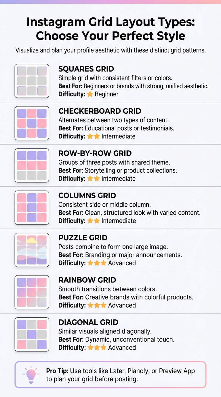
Instagram Grid Layout Types and Best Use Cases Comparison Chart
Your grid is the first thing visitors notice, and it sets the tone for their experience. A well-organized layout keeps them engaged, while a chaotic one can push them away. The trick is to pick a layout that aligns with your content style and reflects your brand’s identity.
Grid layouts aren’t one-size-fits-all - they each serve a different purpose. For instance, diagonal grids arrange similar photos or colors diagonally, creating a bold and eye-catching effect. Rainbow feeds, on the other hand, seamlessly transition colors as users scroll, but they require careful coordination to ensure each row connects visually to the next.
Puzzle grids are another option, combining multiple squares to form one large, impactful image. These are perfect for big announcements or showcasing your branding. However, keep in mind that each post within the puzzle needs to stand on its own.
For a cleaner, more professional look, border grids use consistent frames - like white space, circles, or rectangles - to reduce visual clutter. This approach creates breathing room between posts and makes your feed feel more polished. As Influencer Marketing Hub explains:
"Visuals are everything on Instagram. Even if you have valuable content for your audience, it might not have the desired impact if you don't present it in a visually-appealing manner."
Here’s a quick guide to some popular grid layouts and their best use cases:
| Grid Layout | Description | Best Use Case |
|---|---|---|
| Squares | Simple grid with consistent filters or colors | Great for beginners or brands with a strong, unified aesthetic |
| Checkerboard | Alternates between two types of content | Ideal for brands sharing educational posts or testimonials |
| Row-by-Row | Groups of three posts with a shared theme | Perfect for storytelling or launching product collections |
| Columns | Consistent side or middle column | Offers a clean, structured look with varied content |
| Puzzle | Posts combine to form one large image | Best for branding or major announcements |
| Rainbow | Smooth transitions between colors | Works well for creative brands or those with colorful products |
| Diagonal | Aligns similar visuals diagonally | Adds a dynamic, unconventional touch |
Pick a layout that tells your brand’s story visually. Once you’ve chosen a style, planning tools can help you bring your grid to life.
After deciding on a grid layout, the next step is to use tools that let you preview and fine-tune your feed before posting. These tools give you a visual roadmap, so you can ensure your grid flows seamlessly.
Most of these tools, including Later, Planoly, and Plann, offer free versions that allow up to 30 posts per month for one Instagram account. Their drag-and-drop interfaces make it easy to experiment with new content and see how it fits into your feed, ensuring your grid stays visually cohesive.
Building an eye-catching Instagram aesthetic is only half the battle - you also need the right audience to appreciate it. Enter UpGrow, an AI-driven Instagram growth service designed to connect you with real followers who resonate with your visual style, all while staying within Instagram's guidelines. Here's how this platform can help elevate your audience engagement.
UpGrow uses advanced algorithms to pinpoint followers based on filters like niche, interests, hashtags, location, age, gender, and language. Whether you're running an account focused on minimalist fashion or vibrant travel photography, you can tailor your targeting settings directly in the UpGrow dashboard. For example, a minimalist fashion page might focus on hashtags like #minimalistfashion or #capsulewardrobe to attract a like-minded audience.
Beta users of the UpGrow Boost™ feature, which leverages pattern recognition to accelerate growth, reported a 275% increase in monthly followers. The platform claims to help users grow their audience 10 times faster than traditional methods. With over 100,000 users since 2016, UpGrow’s approach has a proven track record.
This combination of precise targeting and in-depth analytics ensures your content reaches those who genuinely connect with your aesthetic.
UpGrow goes beyond just increasing your follower count. It also helps you refine your profile to make a lasting impression. The AI Profile Optimization tool offers tailored suggestions for your username, bio, and profile picture, ensuring your aesthetic is cohesive and polished from the moment someone visits your page.
The platform’s intuitive dashboard provides live updates on follower growth, engagement rates, and content performance. This allows you to identify which posts generate the most engagement and fine-tune your visual strategy. As Cave Social explains:
"Analytics will let you know where your followers are from, what time they are online, and what types of content perform the best. Ultimately, these numbers let you iterate... giving your audience more of what they want".
With a stellar 4.98/5 rating from over 58,000 reviews, UpGrow has earned its reputation as a trusted tool for authentic growth. Real-time feedback empowers you to refine your aesthetic approach and stay connected with your audience.
Maintaining a consistent aesthetic while staying relevant to trends can be tricky, but UpGrow makes it easier with its Viral Content Library. Available on the Turbo plan at $129/month, this feature provides trending post ideas, templates, and niche-specific content. It’s a great way to keep your feed fresh without compromising your visual identity.
Higher-tier plans also include up to 30 AI-generated posts per month, ensuring you always have high-quality content ready to go. You can customize templates to match your color palette and theme, helping you maintain a cohesive look while keeping up with the latest trends.
Your Instagram aesthetic isn’t something you set up once and forget. As your brand grows and trends evolve, your visual identity should shift too, but in a way that keeps your core style intact. The goal? Intentional evolution that ensures your brand stays recognizable while feeling fresh.
Your aesthetic should grow alongside your brand, but consistency is key. A well-curated feed ensures your posts look connected, even if they’re not identical. Start by revisiting your color palette and visual style periodically. Keep 2–3 key elements constant, and experiment with smaller accents. Think of it as an 80/20 balance - 80% consistency, 20% experimentation.
If you’re transitioning to a new aesthetic, take it slow. Gradual changes over several weeks work better than abrupt shifts. Use cues like seasons or milestones to guide the transition. For instance, introduce warmer tones and softer lighting during autumn while keeping your primary colors steady. A creative approach is the "rainbow grid", where colors subtly change across 9–12 posts - the number that fills a visitor’s initial screen when they land on your profile.
To make updates seamless, save custom presets in editing apps like Lightroom or VSCO. These tools help maintain a consistent tone, even if your content varies. If you’re sharing user-generated content that doesn’t quite match your style, apply your signature filter to align it with your feed. And don’t overlook your Instagram Highlights - update their covers to reflect any aesthetic changes for a polished, cohesive profile.
Once you’ve nailed your core aesthetic, adding trendy elements can keep your feed feeling current. The trick is to embrace trends without losing your brand’s identity. Right now, Instagram is seeing some interesting trends: unedited "photo dumps" that feel casual but curated, blurred images with a high-fashion edge, grainy visuals with muted tones, and posts featuring Instagram’s native fonts for a seamless platform vibe.
Before committing to a trend, test it in your Stories. Use features like polls or track replies and shares to gauge your audience’s reaction. If the response is positive, consider weaving those elements into your main feed. Instagram Insights can help you measure whether these changes boost engagement, like more saves or shares.
For a flawless transition, use grid planning tools to preview how trend-inspired posts will look alongside your existing content. This step is crucial since your most recent 6 posts often determine whether someone decides to follow you. By blending trends thoughtfully with your established style, you can keep your feed both dynamic and recognizable.
Crafting a visually appealing and consistent Instagram aesthetic is all about being intentional. It’s not just about pretty pictures - it’s about creating a profile that’s instantly recognizable. Start with the basics: pick 2–3 primary colors and stick to them. Tools like UNUM (around $7/month) or the free trial of Later can help you plan your grid layout effectively. Over time, this cohesive look becomes your visual signature.
But your aesthetic isn’t limited to just your grid. Every element of your profile contributes to your brand’s story. From your profile picture to Story Highlights covers and even Reels thumbnails, everything should align with your visual identity. This unified look helps tell a consistent story about your brand. To keep things fresh and engaging, try following the 80/20 rule - 80% on-brand content and 20% that shows personality. This balance ensures your feed looks polished without feeling overly rigid.
First impressions matter. Visitors often decide whether to follow you based on your most recent six posts. To maintain that all-important consistency, use saved presets and brand guidelines to keep your visual identity intact as your content evolves.
For those looking to take things a step further, tools like UpGrow can help amplify your efforts. With features like intelligent targeting and detailed analytics, you can ensure your beautifully curated feed reaches the right audience - people who will engage with your content and stick around.
Choosing the right color palette plays a huge role in shaping a visually appealing and cohesive Instagram profile. Start by picking colors that reflect your brand’s personality and the vibe you want to give off. For example, soft neutral tones can create a sense of calm and relaxation, while bold, vibrant hues bring energy and excitement to your feed.
To make your palette stand out, consider using color harmony principles. Pair complementary colors (those opposite each other on the color wheel) for striking contrast, or stick with analogous colors (those next to each other) for a more seamless and unified appearance. If you’re unsure where to start, tools like color palette generators can help you brainstorm and fine-tune your choices. The key is consistency - use the same palette across your photos and graphics to build a strong, recognizable aesthetic that speaks to your brand and connects with your audience.
Creating an Instagram profile that stands out starts with planning your grid layout. Using tools like grid planners and feed preview apps can make the process much smoother. These tools let you play around with colors, themes, and post arrangements so your profile reflects the aesthetic you’re aiming for.
Many of these apps come packed with handy features like drag-and-drop options, scheduling tools, and content previews. This means you can easily maintain a consistent style and ensure your feed looks polished and professional. With the right planning, your Instagram feed can grab attention and keep your audience engaged.
Creating a consistent Instagram aesthetic is key to growing your follower base. Why? Because a visually appealing and well-organized profile grabs attention and leaves a lasting first impression. When your account has a unified look, it’s more likely to catch the eye of visitors and encourage them to hit that "Follow" button.
On top of that, sticking to a polished aesthetic strengthens brand recognition and builds trust. A cohesive style makes your content more engaging and shareable, helping your audience connect with your identity. This sense of consistency plays a big role in attracting new followers and keeping your current audience loyal.
Share this post


