Instagram's New Grid Sizes Update: Everything You Need to Know
Instagram's latest grid update features a taller layout and new dimensions for posts. Learn how to adapt your content for optimal visibility.
Instagram's latest grid update features a taller layout and new dimensions for posts. Learn how to adapt your content for optimal visibility.
4.98 /5 - from 58k reviews
Trusted by 50,000+ creators — get real engagement delivered to your profile in minutes, not days.
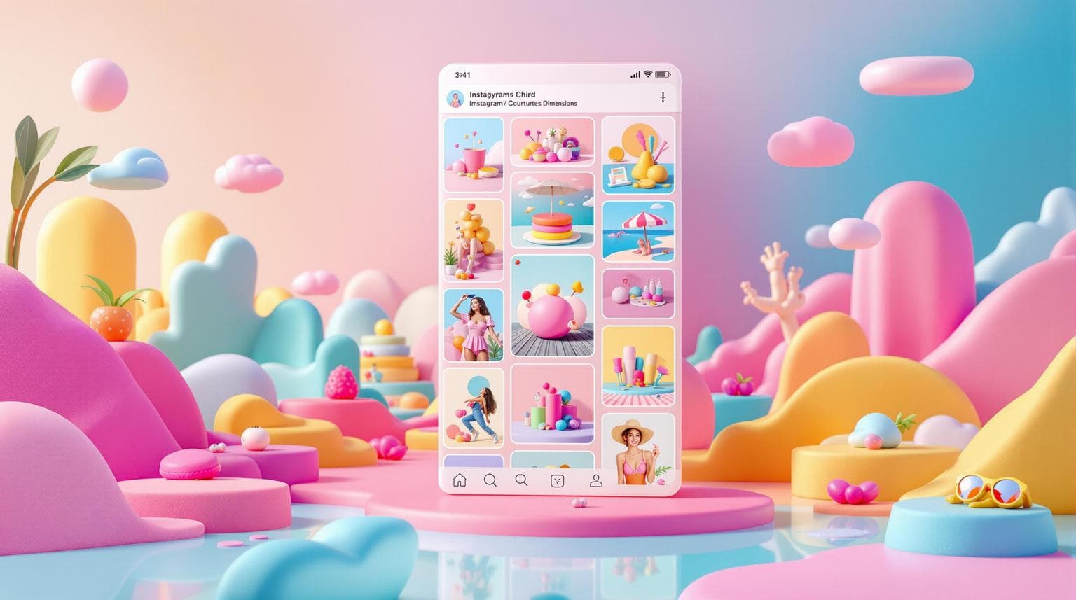
Instagram recently introduced a taller grid layout for profiles, moving from the traditional square format (1:1) to a vertical 3:4 aspect ratio. Here's what you need to know:
| Format | Dimensions | Aspect Ratio | Best Use Case |
|---|---|---|---|
| New Grid Preview | 1012.5 x 1350 px | 3:4 | Profile grids |
| Feed Posts | 1080 x 1350 px | 4:5 | Portrait posts, carousels |
| Square Posts | 1080 x 1080 px | 1:1 | Infographics, profile images |
| Stories/Reels | 1080 x 1920 px | 9:16 | Vertical videos, stories |
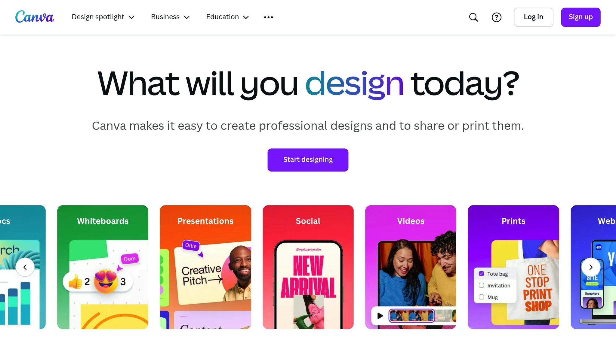
To make your content look great in both the new and old grids, focus on designing posts in the 4:5 ratio while keeping key elements centered within a 1:1 square. Use tools like Canva or Adobe Express for easy resizing and alignment.
Instagram feed posts and carousels support multiple formats, with portrait orientation offering better visibility. Here are the key aspect ratios and dimensions for feed content:
| Post Type | Dimensions | Aspect Ratio | Best Use Case |
|---|---|---|---|
| Portrait | 1080 x 1350 px | 4:5 | Feed posts, carousels, product showcases |
| Square | 1080 x 1080 px | 1:1 | Profile pictures, infographics |
| Landscape | 1080 x 566 px | 1.91:1 | Wide-angle photos, panoramas |
Make sure all slides in a carousel use the same orientation for a consistent look. Now, let’s dive into Instagram’s vertical formats for Stories, Reels, and Live broadcasts.
Vertical formats like Stories, Reels, and Live broadcasts require specific dimensions for the best results:
Instagram has introduced subtle changes to how posts appear in the grid preview:
To optimize your content across all formats:
When designing posts, make sure all essential elements stay within the central 1080 x 1080 area for best results.
"When it comes to making your posts work in this new 4:5 grid preview, the secret lies in strategic positioning." – Kittl
This approach ensures your posts retain their visual impact, even with the updated grid format. Next, focus on revising older posts to match this updated design style.
To make sure older content looks good on both the classic and updated grids, consider these adjustments:
| Content Type | Original Size | Updated Size | Adjustment |
|---|---|---|---|
| Feed Posts | 1080 x 1080 px | 1080 x 1350 px | Extend the height. |
| Carousel First Slide | 1080 x 1080 px | 1080 x 1350 px | Center key elements. |
| Reels Cover | Any size | 1080 x 1920 px | Resize to fit 1080 x 1920 px. |
Simplify these updates with tools like Adobe Express and Canva, which offer pre-set dimensions and cropping options for the 4:5 format. Features include:
"Optimize for Both Square and Taller Grids: Place text and critical elements within the center square to accommodate users without the update." – Your Social Team
Keep in mind that while the grid preview displays a 3:4 ratio, Instagram allows uploads up to 4:5 (1080 x 1350 px). Using these tools ensures your Instagram profile maintains a polished and cohesive appearance.
Instagram's staggered rollout means your content needs to look polished in both grid formats. If your posts appear misaligned, you can fix this with Instagram's built-in tools. Simply tap the three dots on the post, select Edit, then choose Adjust Preview. From there, reposition the image to improve its grid alignment.
Now, let’s talk about designing posts that work well in both grid styles.
Instagram's grid preview uses a 3:4 ratio (1012.5 x 1350 px), but uploads must follow a 4:5 ratio (1080 x 1350 px). Here’s a breakdown of how content should be optimized:
| Content Type | Maximum Dimensions | Optimal Preview Area |
|---|---|---|
| Feed Posts | 1080 x 1350 px | Center 1080 x 1080 px |
| Carousel First Slide | 1080 x 1350 px | Center 1080 x 1080 px |
| Grid Preview | 1012.5 x 1350 px | Varies by device |
To ensure your posts look great in both grid formats:
Revise your content calendar to prioritize vertical posts with a 4:5 aspect ratio. For older posts, use Instagram's adjustment tools to align them with the new grid format. To maintain a cohesive feed:
Instead of deleting older posts, use Instagram’s tools to tweak their appearance. This way, you can preserve engagement history while ensuring your profile looks consistent and polished.
Instagram's taller grid opens up new ways to tell your story by offering more vertical space. To make the most of this feature:
These tweaks to your framing can help you better use the available space and create posts that grab attention.
Making the most of the extra vertical space can lead to more dynamic and engaging posts. Here’s how to optimize your design:
Composition Strategy
Focus on key areas of the grid to create visually appealing posts:
| Grid Zone | Ideal Content | Purpose |
|---|---|---|
| Top Third | Bold visuals | Capture attention instantly |
| Middle Third | Main subject or message | Highlight the core content |
| Bottom Third | Call-to-Action | Encourage interaction |
Visual Flow Optimization
Ensure your profile feels cohesive and inviting by:
Professional Tools Integration
Leverage tools like Canva or Adobe Express to craft polished posts. Focus on balancing standout visuals with clear messaging, and make sure important elements are centered so they look great in both the grid and individual post views.
To make the most of your Instagram grid, follow these practical steps:
Focus on Both Grid Formats
Position key visuals and text within the central square zone (1080 x 1080 px). This ensures your content looks sharp and clear on both grid layouts.
Stick to the 4:5 Ratio
Use the 4:5 ratio (1080 x 1350 px) for feed posts and carousels. As Adam Mosseri, Head of Instagram, explains:
"We started with the tall grid because most photos and videos that are uploaded to Instagram at this point are vertical and rectangles do a better job showing off those photos and videos. That said, I know some of you spend a lot of time tweaking your grids and this blew all of that up, so we're going to improve the ability to customize those thumbnails to make it easier to get back to a place you're happy with."
Update Your Older Posts
For previous uploads, tap the three dots on a post, select 'Edit > Adjust Preview,' reposition your image for better alignment, and save.
Use Grid Planning Tools
Try tools like UNUM, which let you preview both 1:1 and 4:5 aspect ratios. These tools can help you keep your feed visually consistent while adapting to changes.


