10 Highlight Cover Design Tips for Instagram
Elevate your Instagram profile with these 10 essential tips for designing standout highlight covers that reflect your brand identity.
Elevate your Instagram profile with these 10 essential tips for designing standout highlight covers that reflect your brand identity.
4.98 /5 - from 58k reviews
Trusted by 50,000+ creators — get real engagement delivered to your profile in minutes, not days.
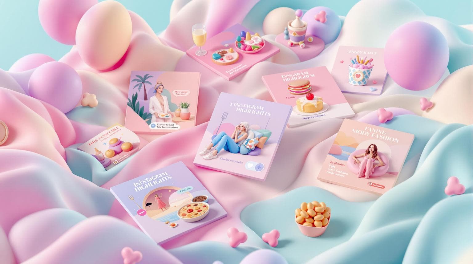
Instagram Highlight covers are the first thing people notice on your profile. They help organize content, showcase your brand, and leave a lasting impression. Here’s how to make them stand out:
These steps will make your Instagram profile look organized, professional, and engaging.
Using consistent colors helps your brand stand out and gives your Instagram Highlights a polished look. Your Highlight covers should match the color palette already used in your website, logo, and other marketing materials.
Here are some ways to incorporate your brand colors effectively:
Keep your palette simple - stick to 2-3 colors. This keeps your profile clean and visually appealing while reinforcing your brand identity.
Quick tip: Save your brand’s color codes (like HEX, RGB, or HSL) to ensure consistency across all designs.
If you don’t have a set color palette yet, pick colors that:
Finally, test your colors on different devices. Colors might look perfect in your design software but can appear different on mobile screens, where most people will view your profile.
Pick simple and easy-to-recognize icons for your Instagram Highlight covers. Make sure each icon represents its content well and remains readable, even on smaller screens.
A great example is using a camera icon to represent photography. You can find pre-made icon sets on platforms like Canva, Adobe Creative Cloud, or Flaticon.
Clear icons help maintain a cohesive design style, setting the stage for consistent design practices in the next tip.
A consistent design makes your Instagram profile look polished and professional. When your covers share common design elements, your profile feels cohesive and easy to navigate.
Start by choosing a single background style for all your covers. Some options include:
Stick to uniform design rules across all covers:
For layout, follow these guidelines:
For example, if you use circular frames with a 4px white border and centered icons, make sure every cover follows that exact setup. This consistency gives your profile a polished, intentional look.
To make things easier, create a master template for your cover design. Then, duplicate it for each new cover. This approach ensures every design aligns with your brand while saving you time. A well-organized, visually appealing profile strengthens your brand identity and keeps your audience engaged.
Typography plays a key role in creating effective Instagram highlight covers. While fancy or decorative fonts might catch the eye elsewhere, they can be hard to read when scaled down on smaller screens. Stick with clean, simple fonts that are easy to read on mobile devices. Prioritize legibility over style to ensure your design is clear and gets the message across at a glance.
Getting the right dimensions is key to a polished Instagram profile. For Instagram highlight covers, stick to 1080x1920 pixels - this matches the size of Instagram Stories and keeps your designs sharp after cropping.
Here’s how to ensure your covers look great:
This approach helps your covers look clean and professional.
Your highlight covers should include subtle touches that reflect your brand identity. These details help create a consistent and polished look for your profile.
Here are some simple ways to incorporate brand elements:
Always preview your covers together to ensure they feel balanced and visually aligned.
Create highlight covers that grab attention by choosing colors wisely. Stick to your brand colors, but follow these practical tips to boost visibility:
Pro Tip: Apply a thin white or black outline (1-2 pixels) around icons or text to make them stand out, especially when working with lighter colors like pastels.
Keep in mind that Instagram compresses images, so select colors that stay sharp even after compression. Test your covers on different devices to make sure they look vibrant and easy to read everywhere. These techniques will help your profile stay polished and cohesive.
Make sure to test your highlight covers on a variety of mobile devices. What looks great in a design preview might not translate perfectly to Instagram. Testing on actual devices helps you catch any issues. Check how your covers appear on different screen sizes to ensure icons and text are easy to read. Adjust as needed for the best visibility.
Be sure to test on both iOS and Android devices since they can display things differently. Focus on these key areas:
This step ensures your covers look polished and consistent, no matter which device your audience is using.
Creating highlight covers from scratch can take a lot of time. Thankfully, design templates offer a faster way to create polished covers while keeping a consistent look.
Platforms like Canva and Adobe Express have ready-made Instagram highlight cover templates. These templates usually include:
Once you pick a template, tweak it to match your brand. Adjust the colors to fit your brand palette, replace icons to match your content categories, and use fonts that align with your style. You can even create a master template that reflects your brand’s identity and save it for quick updates in the future.
When selecting templates, keep these tips in mind:
Your Instagram profile isn’t static, and your highlight covers shouldn’t be either. Regularly updating these covers ensures your profile stays in sync with your brand’s evolving look and feel.
Consider updating your covers when:
Think of your highlight covers as living elements of your brand. Regular check-ins and updates keep them relevant and visually appealing.
To tie everything together, here’s how to finalize your Instagram redesign strategy: effective highlight covers blend thoughtful design with a clear strategy to enhance your profile’s overall look.
Great highlight covers should:
Keep your designs fresh by updating them regularly. This ensures they stay in sync with your brand’s growth and adapt to new content or design tweaks.
Don’t be afraid to experiment. Test various color schemes, icon styles, and layouts to see what clicks with your audience while staying consistent with your brand’s style.
Clear, functional covers not only improve your profile’s appearance but also strengthen your brand presence.


