Ultimate Guide to Minimalist Highlight Reel Aesthetics
Learn how to create engaging minimalist Instagram highlight reels that enhance profile visibility and interaction.
Learn how to create engaging minimalist Instagram highlight reels that enhance profile visibility and interaction.
4.98 /5 - from 58k reviews
Trusted by 50,000+ creators — get real engagement delivered to your profile in minutes, not days.
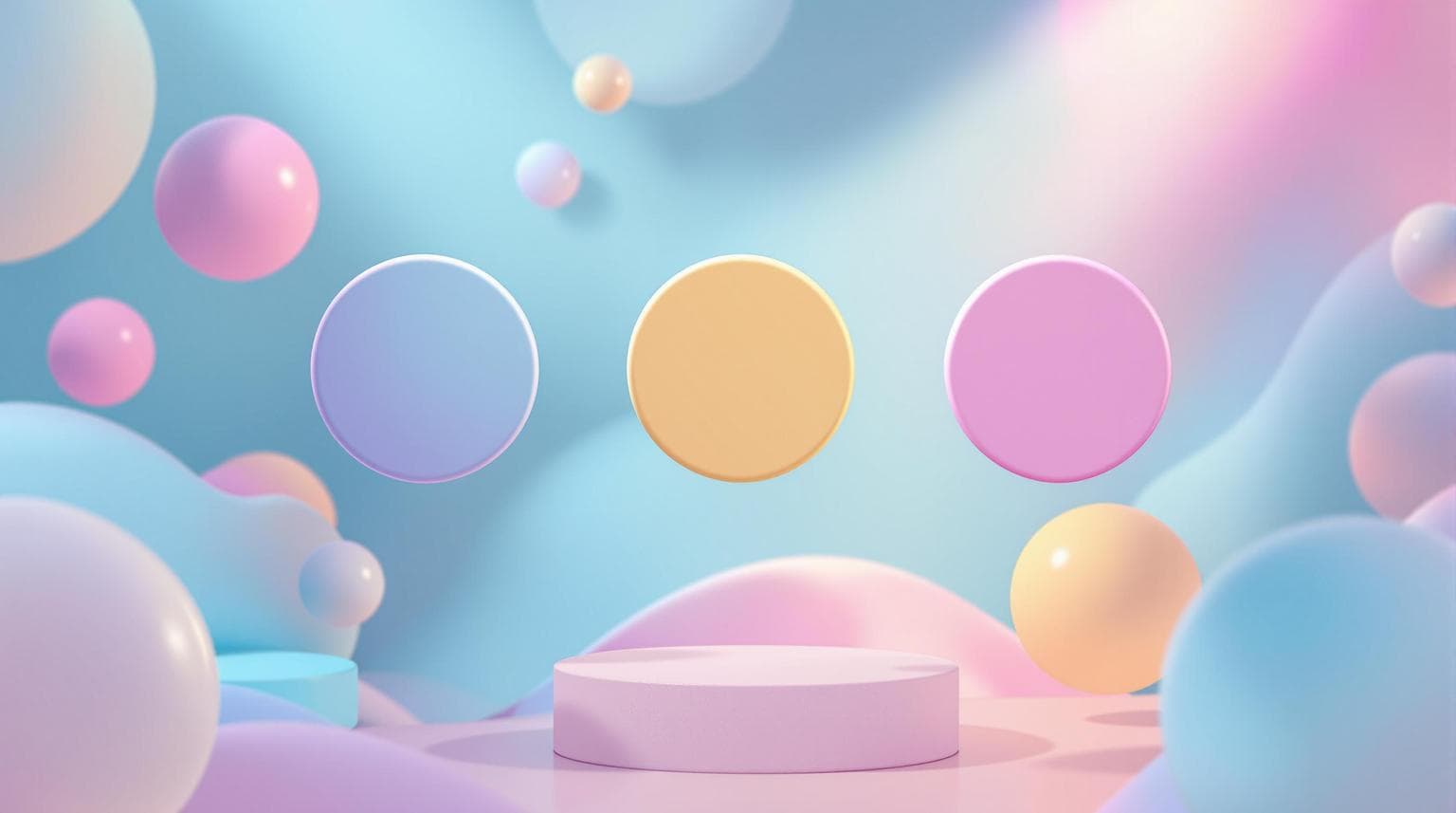
Minimalist Instagram highlight reels can boost profile engagement significantly - 27% more saves and 19% higher swipe-up rates. They rely on clean designs: white space, consistent colors, and simple icons. Here's how to create them:
Minimal designs load faster, improve readability, and align with branding. Tools like AI (e.g., UpGrow) can optimize designs for engagement. Keep it simple, consistent, and clear for the best results.
Creating minimalist highlight reels that stand out requires following some essential design principles.
Stick to 2-3 complementary colors that align with your brand. Research from Kimp.io shows this approach can increase brand recognition by 80%. Here are some effective strategies for color selection:
These methods echo the success of brands like Glossier, which leverage cohesive palettes to strengthen their visual identity.
Typography and icons should remain clear and easy to read, even at smaller sizes. Sans-serif fonts like Helvetica Neue and Inter work particularly well for Instagram highlights, especially when text is kept under 15 characters.
Etsy's analysis of 600 minimalist covers highlights the effectiveness of simple geometric shapes and single-line illustrations in driving engagement. Travel bloggers have seen 35% higher engagement by using these types of designs for location highlights.
| Element Type | Best Practice | Why It Works |
|---|---|---|
| Fonts | Sans-serif, bold weight | Easy to read at small sizes |
| Icons | Single-line drawings | Stay clear when scaled down |
| Text Length | Under 15 characters | Prevents clutter and improves readability |
White space isn’t just empty space - it’s a powerful design tool. According to Smartsheet, using white space strategically creates a clear visual hierarchy and makes content easier to process [5].
Professional templates often suggest keeping 10-15% padding around key elements to maintain balance and improve the overall look.
Creating highlight reels can be straightforward with a few practical steps and a focus on clean, effective design.
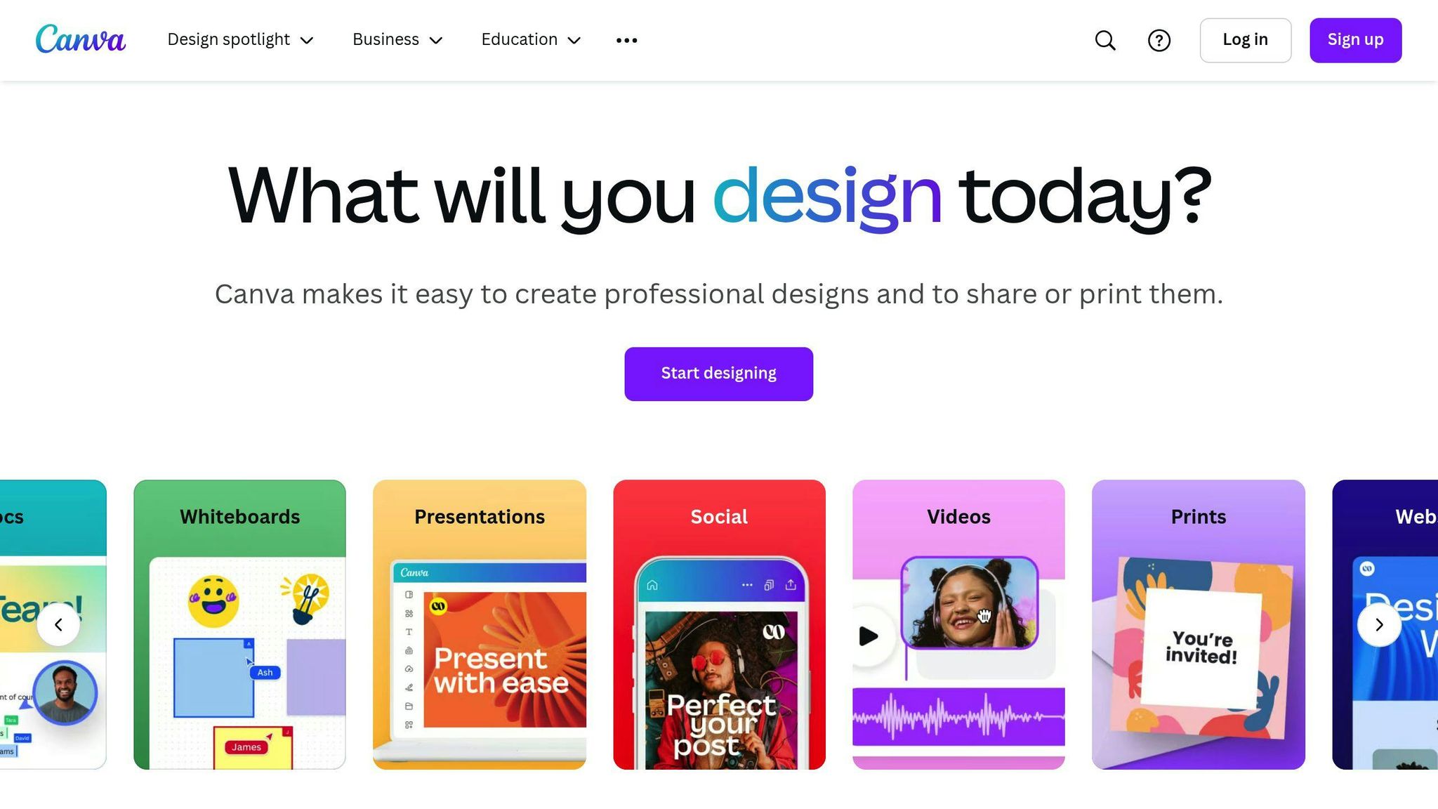
Canva is an excellent tool for designing polished highlight covers. Start by choosing the "Instagram Story" template, which is set at 1080x1920 pixels. Stick to simple design principles for a clean look:
Canva’s Brand Kit can help you save your brand colors and fonts, making it easier to maintain consistency.
| Design Element | Specification | Purpose |
|---|---|---|
| Background | Solid color or subtle gradient | Creates a clean, professional look |
| Icon Size | 40-50% of the cover area | Ensures icons are clear and noticeable |
| Margin Space | 20-30% padding | Keeps the design balanced and uncluttered |
When exporting your covers, make sure they meet Instagram’s size standards. Use 1080x1920px PNG files (under 30MB) with a 150px safety margin and an sRGB color profile. Instagram’s recommended dimensions include:
This ensures your covers display correctly without being cropped or distorted.
Organize your highlights in a way that captures attention and keeps your profile organized. Place your most important categories, such as "Products" or "About", at the beginning of your highlight list. Keep the total number of highlights between 5 and 7 to avoid overwhelming your audience.
Here’s a simple workflow to set up your highlights effectively:
Adding subtle animations can give your highlight covers a polished look without overwhelming viewers. The trick is to keep movements gentle and minimal. For instance, Canva's "Animate" feature includes a "Drift" preset that creates soft floating text effects, ideal for minimalist designs. You can also try fade transitions with a duration of 0.5 to 1 second and set the opacity to around 30% for a smooth, floating effect.
Interestingly, Instagram's data shows that covers with multiple animations often see a 37% drop in completion rates compared to those with simple, single-element animations. To get the best results, stick to one animation type per cover and keep the duration under 1.5 seconds. These small movements can boost engagement while keeping your design clean.
To ensure your highlights are both stylish and accessible, focus on contrast and clarity. Following basic accessibility guidelines can help you reach a broader audience while maintaining a minimalist design. Here are some key tips:
Studies show that highlights with proper contrast get 23% more sustained views. Keep your text concise - stick to 3-5 impactful words for the best readability.
You can keep your highlights fresh and relevant by making small seasonal updates without losing your minimalist style. Instead of a full redesign, try incorporating subtle elements that match the season or event.
For example:
"Seasonal overlays achieve 73% recognition when using existing brand elements, proving temporary updates needn't break minimalist frameworks".
For short-term promotions, Instagram's built-in filters can help you stay consistent with your brand's look. This approach allows you to stay visually cohesive while staying timely and relevant.
AI tools are now taking minimalist designs to the next level by using data to refine and optimize them.
UpGrow's AI tracks metrics like view completion rates, showing that minimalist designs can boost retention by 75%. It also highlights that icon-based covers attract 32% more taps compared to text-heavy alternatives.
The platform analyzes engagement data across various highlight styles, giving creators practical tips to improve their designs.
AI tools are now equipped to analyze and improve highlight covers by focusing on key design elements that impact performance:
| Design Element | AI Analysis | Recommended Action |
|---|---|---|
| Icon Clarity | Issues with thumbnail visibility | Increase stroke width by 2px |
| Color Balance | Conflicts with brand guidelines | Adjust hue saturation by 15% |
AI has also introduced "negative space optimization", which simplifies designs without compromising brand identity. Early users of this feature have seen save rates increase by 28%. The technology compares your covers to high-performing minimalist profiles, offering suggestions based on proven engagement trends.
Combining the basics with AI tools from section 5 can result in highlight reels that grab attention and boost engagement. Studies indicate that highlight covers using no more than two colors and a single focal icon see a 92% increase in engagement rates.
The key to effective highlight reels is keeping alignment consistent with brand elements. These principles, paired with AI tools, ensure a cohesive and engaging result.
| Element | How to Use It |
|---|---|
| Icons | Focus on one clear, outlined icon |
| White Space | Maintain at least 40% padding |
Start by auditing your current content with Instagram Insights data.
For tracking progress, try UpGrow's AI dashboard. It offers bi-monthly performance reviews and shows that branded CTA covers can lead to a 37% boost in engagement.


